Yesterday on the Wandering DMs channel we had the good luck to interview Goodman Games' Julian Bernick and Bob Brinkman, who gave us an inside look at their upcoming DCC Dying Earth boxed set (now on Kickstarter). One of the nifty things they highlighted was the achieved-stretch-goal of the "Supplemental art folio", which was of particular excitement to their backers -- including art from their all-star team of Doug Kovacs, Erol Otus, Russ Nicholson, and more. This brought a brief tangent to a thesis I've been developing for a while.
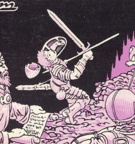
I've come to think that one of the biggest sensibility differences between old-school D&D art and and newer-school art is the amount of violence depicted against ostensibly player-character-types. I find that new-school illustrations are frequently "glamour shots" of presumed PCs. In these depictions, the adventurers look generally clean, rested, comfortable, and pretty.
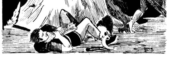
In contrast, the art in early editions of D&D often depicted adventurers in general distress -- dirty, tired, surprised, shocked, terrified, fleeing, smothered, pierced, poisoned, and mangled. And the weight of the body structure was in realistic proportions that looked all-too-humanly fragile, not like models-bodybuilders-superheroes. Compare to actual medieval depictions such as in the Bayeux Tapestry (and the battle scenes on the far right side have a lower border literally covered with dying and dismembered bodies).
I won't argue that this was in all or even most of the art in classic D&D products. But it was frequent enough that flipping through any book you were bound to see a bunch of examples. It gave a signal that the PCs start out overshadowed by a world of lurking horrors, and weren't expected to come out victorious. The body count for early play could be remarkably high, and characters who did achieve levels above 1st were likely the exception, not the rule.
I think I briefly posted this thought on social media a while back, and got some pushback on it. In the interest of providing citations for scholarship (as well as comment and criticism), here are some of the memorable pieces from 1st Edition AD&D products. (These are by no means comprehensive; in the interest of brevity I've rather painfully limited myself to a half-dozen per source.)PHB and DMG


Monster Manual


Fiend Folio


Adventure Modules


Conclusions
So I think that's a pretty airtight case, that flipping through the earliest 1st Edition materials, you're going to get the idea that in D&D, player-character life is cheap. (Note that almost all the pieces above date from 1979 or ealier.)
Of course, the monster books tend to lean a bit more heavily on this theme, for at least two reasons: (1) they simply had a lot more art than other books, and there was close to a commitment that every monster needed to be separately illustrated, and (2) it was the stage for the monsters to "shine" and show off their most horrible features. The work in the UK-produced Fiend Folio is particularly gruesome.
Among the artists who amplified this tone (with several examples above) were of course Erol Otus and Russ Nicholson, who are still pumping out awesome work today (as in the DCC Dying Earth set).
While mainstream D&D has moved off from these possibly transgressive themes, other product lines like DCC and Warhammer maintain the root in Lovecraftian-inspired horror. (On the other hand, something like the work for Hackmaster, from what little I've seen, doesn't thrill me, as it seems to veer into horror-comedy. On the third hand, Erol Otus has successfully done work for it, as well as D&D and DCC, so it's impossible to draw a hard line in the sand on the issue.)
Do you agree that's a fairly stark distinction between early D&D art and the modern products?
What are the pieces that stuck in your mind the most, that I overlooked here?
(And you might be interested in other discussions we've had about Art in D&D here and here.)


In terms of monster manuals, there was a huge drop-off in this type of art with the Monster Manual 2 in 1983. In that tome there are only a couple of pictures with adventurers in them, despite the main artist, Holloway, being well known for his humorous scenes of adventurers in peril. I don't know whether this was a conscious design choice or an outcome of a rushed production job. It makes the book a lot less fun to flip through for inspiration, and I believe most monster books after that followed the same pattern.
ReplyDeleteGood point!
DeleteI will note that, while not to the level of early D&D, many Pathfinder products *do* have heroes in dire straits, much more often than modern D&D art. Examples include the 2nd edition PHB page 455 (a wizard being constricted by a snake) and Bestiary III page 45 (a barbarian being 'eaten' by the carnivorous crystal)
ReplyDeleteDefinitely true in Starfinder as well. Every AP volume puts the heroes in peril right on the front cover. It's not as gruesome as the old art, for sure, but just looking at the most recent cover we have a PC barely defending herself against a huge monster - to the point where her signature weapon seems to be damaged. The volume before that has an interior art piece of a huge explosion cracking one horrified PC's shield while the other PC desperately tries to evade.
DeleteThey still look kinda cool doing it, so it doesn't reinforce the whole "you'll be lucky to make it past 1st level" thing, but compared to the 5e art, Paizo artists definitely get more of that "action movie" feel.
I find that a lot of the 3e and later art lacks action of any kind. Most monsters are shown in isolation, so you can hold it up and say "see, one of these", or similar for weapons and classes. Whenever spells got illustrations uou had action, but it was usually PC-on-NPC violence.
DeleteThanks for that example! I'll confess that PF tends to be a bit of my radar. Not hugely surprised those guys maintain some older-school vibes.
DeleteSo many from the MM, of course (in answer to your final question).
ReplyDeleteI think illustration puts a powerful imprint in the minds of the reader, which is part of the reason why art is so important to an imaginative pastime like RPGs. There is no board, no minis required, so what helps with the initial visualization process (image being the root of imagination)?
And this “imperiled adventurer” artwork is so in contrast from later editions that it can’t help but set the tone and standard for game play.
Interestingly, B/X (perhaps) really shows itself as a transitionary edition in this regard. While its illustrations aren’t nearly as heroic as later editions (starting with Mentzer’s BECMI) none of the illos show the PCs in absolute peril. On the other hand, the detailed textual examples of play (in both the combat and DM’s section) explicitly describe character deaths in such a way as to point to the inimical peril of the activity. It doesn’t leave quite the same impression as the 1E illustrations (a picture being worth a thousand words), but it at least makes clear the expectation.
Contrast Moldvay’s basic book with the Mentzer example of play, wherein the reader is left with an idea that helpful/cherished NPCs may be killed willfully, but the PC is expected to survive (perhaps to later gain “revenge”). Ugh.
I’ll have to look through my 2E and 3E books (I retain copies for academic reasons only) to see if there are ANY real examples of peril or PC destruction. Somehow I doubt I’ll find much (nothing comes immediately to mind).
I don't have the 1989 DMG, and the 1989 PHB didn't seem to have anything relevant to this topic. Here's what I found in my 2nd Edition revised books; I've left out quite a few where a fight seems to be going against the adventurers, or they're encountering something that looks to be out of their league, in favor of only the ones where the monsters have already won or it seems like a foregone conclusion. Even so, it is worth noting that they're pretty much all less "graphic" - as much as you can consider some of the cartoon violence from 1E to be graphic - and stop short of showing adventurers impaled or eaten.
DeletePHB:
p. 14, grell about to ambush a man
p. 17, giant fish preparing to swallow a group of adventurers who are inside Otiluke's Resilient Sphere
p. 24, adventurer surprised by giant ant erupting from the ground
p. 100, adventurer being overwhelmed by kobolds
DMG
p. 63, wizard getting surprised and overwhelmed by jermlaine
p. 131, giant octopus crushing a longship
Huh. I'm surprised. I went through my 2E (and 3E) books after writing my initial comment and found almost nothing in either core set. The illustrations you cite here (from the revised 2E) are nowhere to be found in my books.
DeleteEven so, "about to ambush" or "being surprised" isn't nearly the same as obvious damage/death being inflicted. The THREAT of peril doesn't amount to more than a mild chest-thumping panic. I want more from my D&D than weak-sauce chills/thrills...show me the actual stakes!
I plan on writing my own blog post about this (probably tomorrow), but I have to say that...after reading this post and doing my own research on the subject...I find myself both bemused and, well, somewhat disgusted. And I'll say also that I find myself pitying players who came to the game post-1982 or (worse!) post-1989.
Great thoughts here. It's good to consider the B/X set: admittedly I think there was some intentional "for the kids" design going on, with the boxed sets intended for toy stores. (Of course, that's how my friends and I got into it at a very early age so... thank you!?).
DeleteGood point about the text combat descriptions. AS you know we've pointed a couple times in D&D where a pictorial chart contradicted text, and in every case the picture is what people recall.
Thanks to you guys for looking through the 2E books, I definitely ran out of time for further research!
Looking forward to JB's blog -- wondering if he's disgusted by the violence or the later lack thereof. :-)
"Disgust" is probably too strong a word (I *did* write "somewhat disgusted..."). Regardless the post is up now, for interested folks:
Deletehttp://bxblackrazor.blogspot.com/2021/07/the-art-of-peril.html
; )
@JB
DeleteIf you have the anniversary reprint, the page numbers might be slightly different. Otherwise, you have the 1989 version which, as mentioned, I couldn't really find any artwork that fit the bill.
As for the pieces mentioned, I tried to pick out the most hopeless situations, but on the other hand I probably could have included even more and still been in keeping with Delta's selections from the 1E books. For example, there's a picture of three men trying to fight a fire-breathing hydra that's very similar in tenor to the one shown above with the group fighting the catoblepas. The ones with the kobolds and jermlaine overwhelming a lone PC-type are clearly descendants of the 1E picture with the small creatures netting the adventurer. As for showing ambushes, perhaps they're overused a little, but they're clearly fair game in light of the much-beloved picture of the skeleton rising out of the water to ambush the adventurer who's trying to open a door. I'd say that overall 2E is on par with 2/3 of the pictures that Delta picked out, but excluded the more graphic violence of ones such as the babbler or berbalang.
@ Dan:
DeleteLeaving out the FF (which just ratchets the fear, death, and despair up to another level, even for 1E)...
A "surprised adventurer" or a "possible ambush" does NOT (in my opinion) count for a perilous situation. Surprise happens in D&D; ambushes may happen (they're in the same arena as "surprise" really)...these illustrations of POTENTIAL harm aren't nearly the same as individuals facing ACTUAL harm, the latter of which is evidenced in images of:
- running in fear
- confrontations with facial expressions of abject terror (not just surprise)
- characters held, restrained, knocked out, or grappled
- killing blows (HPs being abstract, this can be any serious physical injury)
- already DEAD bodies lying around (PCs only!)
- characters being shock, enchanted, or otherwise "gotcha'd" by magic and/or traps
Potential peril isn't the same as actual...1st edition AD&D is filled with illustrations of ACTUAL harm. Images of ACTUAL harm are largely missing from 2E and 3E books, being replaced by images of POTENTIAL harm, often ones that "call back" to 1E illustrations of actual harm.
JB, thanks greatly for that post, I think was really great work and commentary!
DeleteHackMaster 4th edition gloriously exemplifies doomed characters in its art.
ReplyDeleteDefinitely a lot there.
DeleteThat pic of the flooding room with the stuck door and a skeleton approaching with a sword always gave me the willies! Definitely old school.
ReplyDeleteYeah, it's one of my favorites! One of the 3E books had a recreation by WAR, which is more action-dynamic, but loses the lost-cold-deep-echoing-doom tone of the original.
DeleteMy favorite has always been this awesome piece on the screen of AC2 of a halfling fleeing in terror from from some unknown foe in the background
ReplyDeleteOh yeah, that's nifty! Thanks for pointing it out, that wouldn't come to mind for me. Gonna post that on my Twitter. :-)
DeleteAlso like that it's on the player's side of the screen, from what it looks like, to remind them what's up. :-)
DeleteI liked the way, in the Goodman Games interview, you described new school PC portrayals: “They look like they smell nice.”
ReplyDeleteAlso I once saw a description of a certain politician, "Looks great, sounds great, smells great". :-D
DeleteLooking through my 4e DMG, and ignoring action scenes where the PCs don't actually look like they are in trouble:
ReplyDeletep. 11: party fleeing while arrows fly at them, one PC supporting his injured comrade
p. 66: PC lighting a torch, unaware that several ghouls are creeping up behind her
p. 70-71: PCs fleeing in panic from dart trap
p. 89: PC fleeing while arrows fly at him
p. 93: PC being struck by a beam of light from a gem being held up by three skeletons (why can't I remember what module that is from?)
p. 130-1: adventurer POV of attacking undead army
p. 201: party being run down by pack of wolves, rats and bats
p. 209: party surrounded and outnumbered by what looks like barghest(?)
And in the PH1:
p. 50-1: party fighting huge white dragon, one PC pinned to the ground under the dragon's foot, dragon about to chpmp
p. 264-5: party in combat with goblins, fighter hits one goblin while goblin shaman shoots PN in the face with a spell
p. 296-7: party fighting drow, one PC dead, one trying to hold off enemy while cleric tries to use a raise dead scroll (no, that's not a good idea in 4e either)
I will say that the PCs are generally less panicked and more competent looking than in earlier artwork, although that's not universally true.
Thanks for checking on that!
DeleteI've often been put off by modern D&D art, where all the pictures do look like they're posing for the camera, it can look very jarring (4e I remember being especially bad for it), but I couldn't exactly vocalise what the problem was, and why I preferred the older art. I just put it down to reading all the Fighting Fantasy books as a kid and assumed it was something about the black and white line art. Thanks for pointing this out!
ReplyDeleteI'm glad this resonated!
DeleteI have a soft spot for the 2nd Ed PHB (1989 printing) "glamour shot" on page 7, where the adventurers are posing for a group portrait (did they bring along a painter henchman?) in front of their kill, a small green dragon. Numerous small injuries and damaged clothing in evidence.
ReplyDelete